While working at INVNT.ATOM, I supported the project team responsible for Xerocon's AI Music Factory.
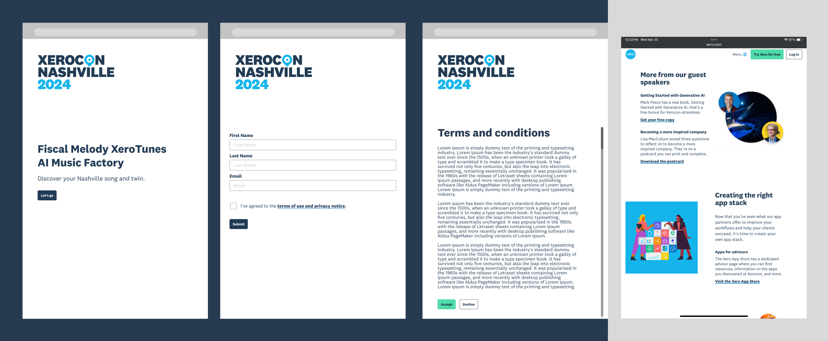
Initially, I was brought onto the project to translate low fidelity wireframes, designed by INVNT AU, from mobile to tablet (8" and 10"). The same team had delivered a prototype for Xerovision FY25, whose users reported poor readability and small touch targets.
In an effort to address feedback and to ensure the tablet wireframes were accessible, I dedicated time to researching UI/UX best practices across different devices. For future reference, I assembled guidelines in a document which covered target sizes, contrast ratios and more.

After the first round of feedback, we went back to the drawing board with the goal to enhance the wireframes with the client's visual identity.
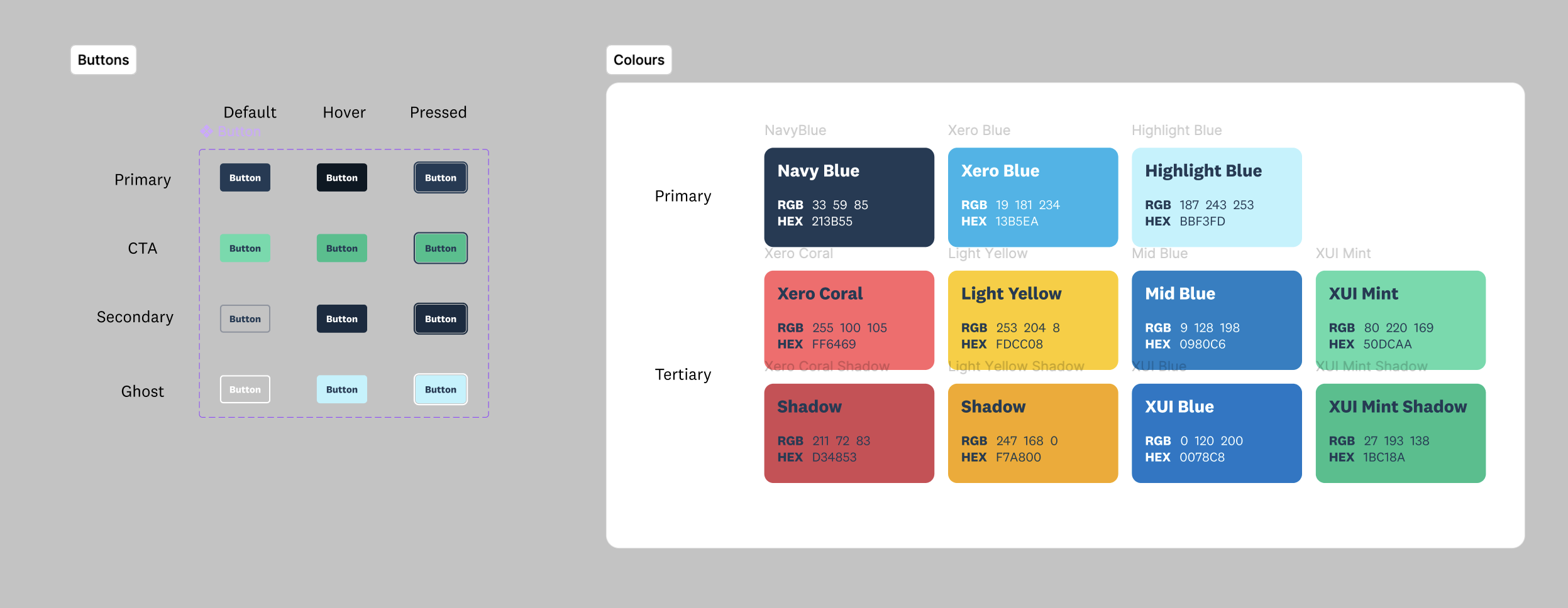
I rushed straight to the Xero brand guidelines to extract the vibrant colour palette and font family, and added them as styles to our Figma file.
Additionally, I closely studied the Xero website to gather visual references for tablet layout and buttons including CTA and links.
With a good understanding of the brand along with my accessibility research, I was able to a range of components including buttons, text fields, link, checkbox, etc. The same approach was applied to typography with headings and paragraphs scaled appropriately for tablets.
At the heart of the experience was multiple choice questions with image responses.
I gathered references from established platforms to move away from the carousel design in the original wireframes.
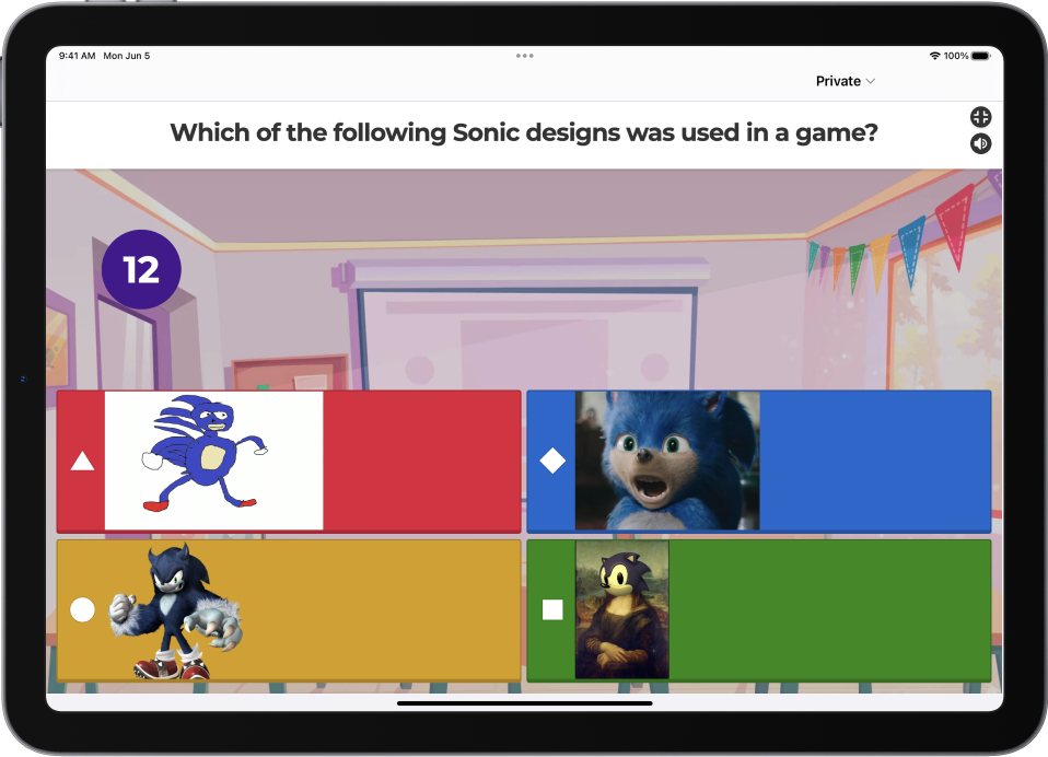
Naturally, Kahoot! was a major source of inspiration. Its large buttons help users avoid accidental presses as the circular timer ticks away. Image responses, however, look and feel isolated from the question prompt.
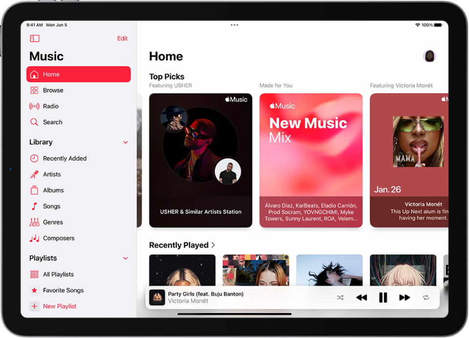
A more visually pleasing example was Apple Music's card previews. The cover art combined with padded copy ensure large target sizes while looking neat.
At the heart of the experience was multiple choice questions with image responses.
I gathered references from established platforms to move away from the carousel design in the original wireframes.
Naturally, Kahoot! was a major source of inspiration. Its large buttons help users avoid accidental presses as the circular timer ticks away. Image responses, however, look and feel isolated from the question prompt.
A more visually pleasing example was Apple Music's card previews. The cover art combined with padded copy ensure large target sizes while looking neat.
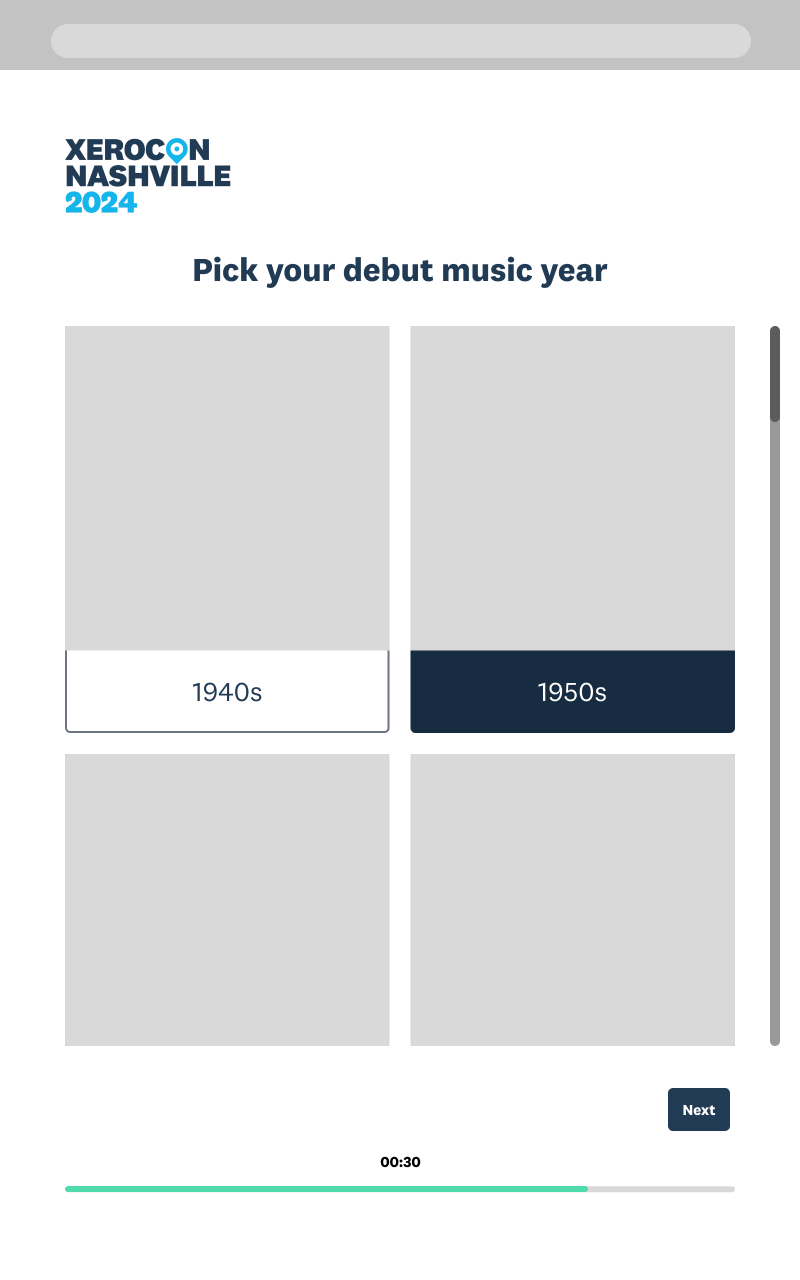
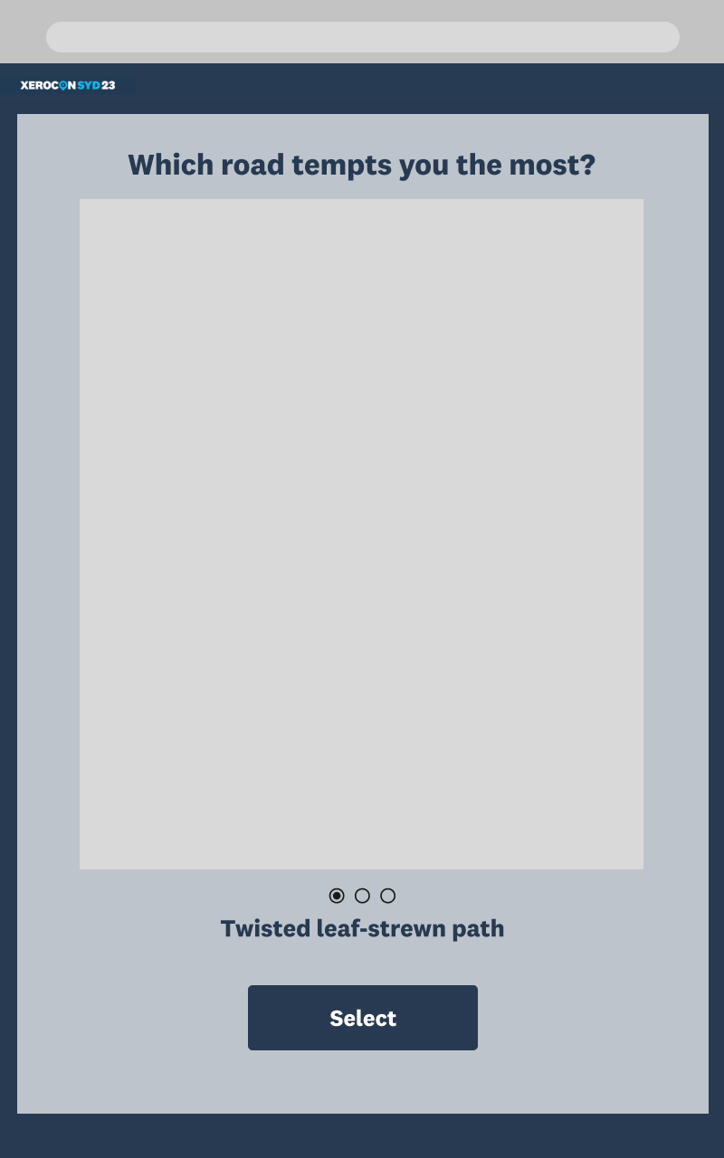
I swapped out the carousel design in the original wireframes with a grid layout, inspired by Apple Music. I reserved a square frame for images while the copy underneath was distinguished by a stroke with slightly curved corners at the bottom. I set it up as a component with default and pressed states.
The circular timer from Kahoot! made its way too in the form of a horizontal bar. The color of the bar changed with respect to time, conveying a sense of urgency. This component was later repurposed as a progress indicator.
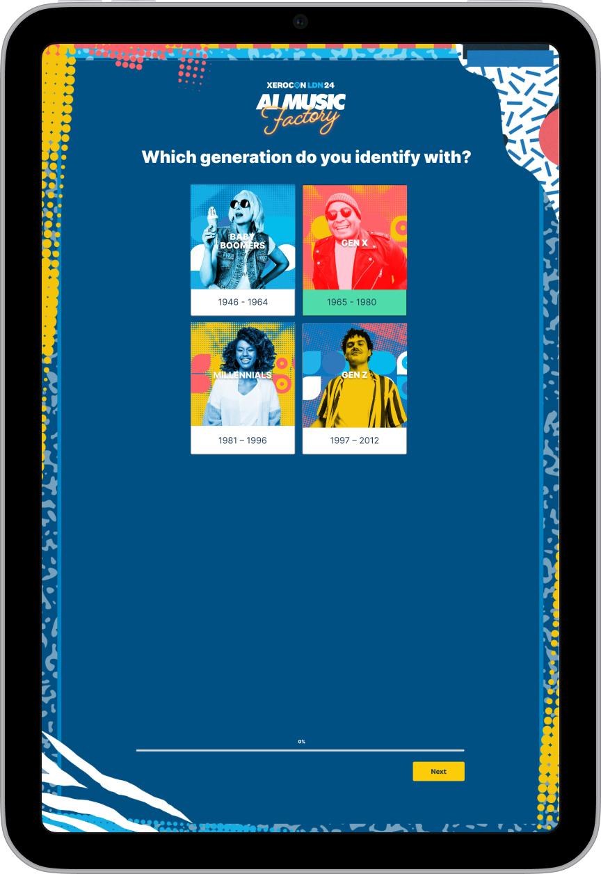
The wireframes were approved and handed over to a senior graphic designer to prepare logo, illustrations and images. The final prototype perfectly captured Xerocon’s music festival theme, while maintaining the structure and components from my wireframes.
Client had approved the design layout, created by a senior graphic designer, for AI-generated artwork posters with a band name and Xero branding. However, they required us to present different color and logo variations.
Since the designer was on leave, I prepared 24 new poster treatments as per the client's request. Besides color variations, I recreated the secondary (horizontal) logo from a vector version of the primary (stacked) logo. To ensure proper kerning and clearspace, I used a raster image file supplied by client.
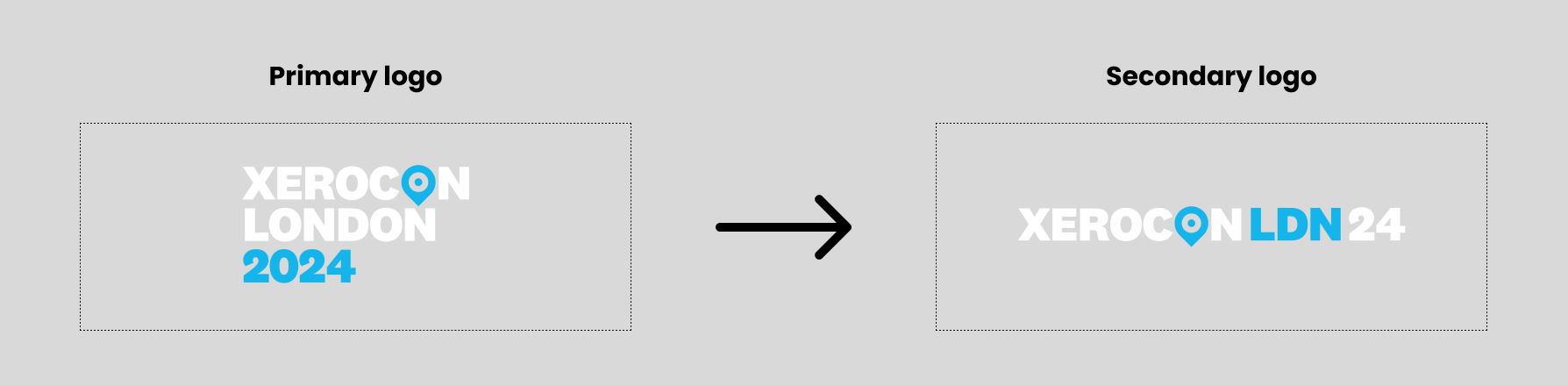
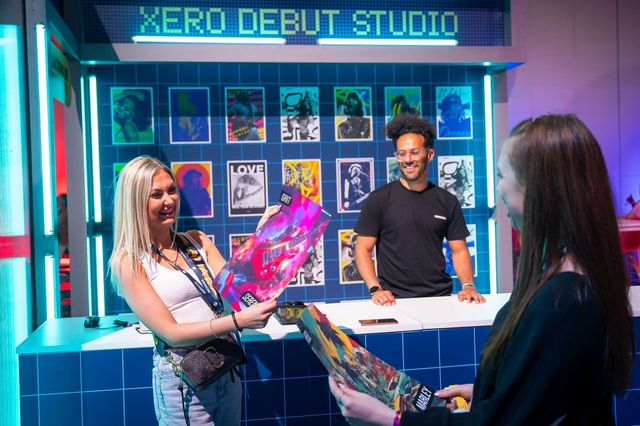
My poster variation with the secondary logo ended up getting the final stamp of approval. Its layout was applied on top of AI artwork to create physical posters which were distributed at the event.
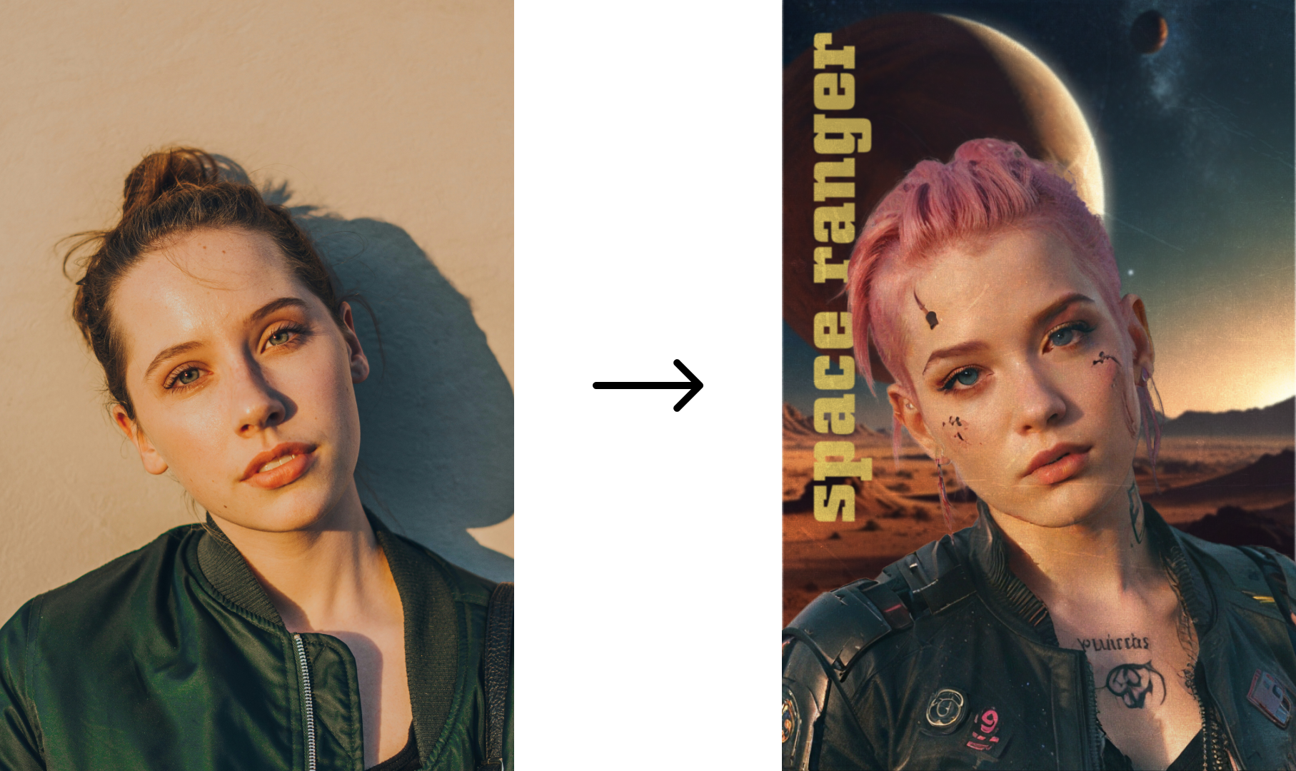
The original scope of the project included AI-generated songs and posters, featuring unique lyrics for each user and their selfies transformed into custom avatars.
In the early stages, I experimented with a range of GenAI platforms including Leonardo AI and Suno AI. For a client presentation, I created mockups of the avatar poster. I started off with royalty-free images and paired them with individually generated assets to compose themed posters.
Due to privacy and legal concerns, these features were stripped down in lieu of a more streamlined AI pipeline. Nevertheless, it was a fun creative exercise with GenAI tools.